Testing Approach
Participants: 5 users who matched Amelio’s target demographic (health-conscious, goal-oriented individuals aged 25–35)
Format: Remote usability testing via Zoom using Figma prototypes
Tasks Tested:
-
Find and start a personalised meal plan
-
Understand the value of the plan via the “How It Works” section
-
Navigate from the homepage to explore other meal plan types
-
Locate consultation call options or meal plan pricing details
Key Insights
✘ Some users expected pricing earlier in the journey, so I added a “Meal Plans" section directly under the hero for transparency.
✔ Users loved the “Get Started” CTA on the personalised plan page, noting it made the experience feel tailored and direct.
✘ 3 out of 5 users initially missed the ‘Steps Towards your personalised Plan’ section because of its placement. I iterated by adjusting its visibility and adding numbered icons for scannability.
✔ The format of the meal plan feature was a highlight, especially when it appeared as a downloadable PDF - users found this practical and easy to use.
Modular Features
The site structure is built to support future expansions, such as fitness integrations, progress tracking, and AI-powered meal suggestions - without disrupting the current user experience.
Subscription Upsell
A clearer pricing journey and personalised plan flow offer an opportunity to introduce tiered subscription models or premium content (e.g. expert consultations, exclusive recipes).
Data-Driven Insights
With the downloadable meal plans and account setup features, Amelio can collect anonymous data to tailor content, track plan success, and improve future recommendations.
Sustainability Tracking
Users showed strong interest in understanding the environmental footprint of their choices. The platform could incorporate CO₂ or waste-reduction metrics tied to users meal plans.
Amelio Nutrition - UX Case Study
70% of users drop off nutrition sites because meal plans feel generic. With Amelio Nutrition, I tackled this problem by creating an engaging, personalised nutrition experience that helps users stick to a healthier lifestyle through customised meal plans and human-centered design.


Overview
Role: Lead UX/UI Designer
Tools: Figma, Shopify (with custom code), Adobe XD, Adobe Express
Research Methods: Surveys, Interviews, Competitor Analyses, Affinity Mapping, Personas, User Flow, Sitemap, Wireframes
Project Duration: 8 Weeks
Problem
Statement
Key challenge:
Despite the growing interest in plant-based diets, many individuals face obstacles such as lack of knowledge, limited recipe options, and concerns about nutritional adequacy. Our goal was to address these pain points by creating an intuitive platform that educates and motivates users towards sustainable eating habits.
Objective:
Design a user-centric mobile application that simplifies the transition to a plant-based diet by providing personalised meal recommendations, tracking environmental impact, and fostering community support.

Design Process
To craft a solution that truly resonated with users, I followed a human-centered design approach grounded in empathy, iteration, and feedback. From research synthesis to high-fidelity prototyping, each phase focused on solving real user pain points while aligning with the broader goals of promoting sustainable, plant-based living. Below is a breakdown of the key stages in bringing Amelio Nutrition to life.
Empathise
Understanding the Problem Space
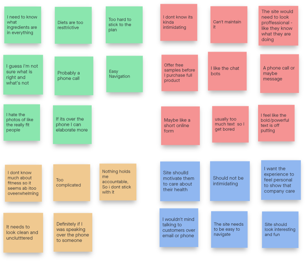
To build a solution that genuinely addressed user needs, I prioritised qualitative research methods - including user interviews, competitor analysis, and stakeholder conversations. These approaches allowed me to uncover nuanced insights that quantitative data alone might overlook.
Who are the main competitors, and what are their strengths and weaknesses?
What key features or requirements does the stakeholder envision for the product?
What are the primary needs, goals, and pain points of our target users?
What factors have previously discouraged users from purchasing meal plans?
Competitive Analysis: Mapping the Market Landscape
To understand the competitive space and identify opportunities for differentiation, I analysed four key players in the nutrition and meal planning industry: My Menu Coach, 3Natural Bionutrition, The Protein Works, and Exante. These companies were selected based on their relevance, popularity, and potential influence on Amelio’s business model. Despite serving similar health-conscious audiences, each competitor offered a unique feature set - with notable inconsistencies in user support, personalisation, and content delivery.
Personalisation vs. Variety
Most platforms offered either personalied meal plans or a variety of preset options - rarely both. This reveals a gap where Amelio could provide flexible yet personalised plans to meet diverse dietary needs.
Content Strategy
Only two competitors (The Protein Works and Exante) provided blogs or educational content. This is an opportunity for Amelio to lead with value-driven, informative resources that empower users.
User Experience Tools
Surprisingly, search features were uncommon. Including robust filtering or intelligent search tools in Amelio could significantly enhance user navigation and accessibility.
Consultation Support
Personal consultations were only available from niche providers. Integrating expert guidance (live or AI-powered) could position Amelio as a holistic and supportive wellness partner.


Strategic Implications
Amelio has the opportunity to stand out by:
-
Combining personalised planning with a flexible meal variety.
-
Offering educational content and consultation support to increase user trust.
-
Implementing UX features like advanced search and tailored onboarding to streamline the user journey.
-
Exploring a subscription model to drive retention and recurring revenue.
Define
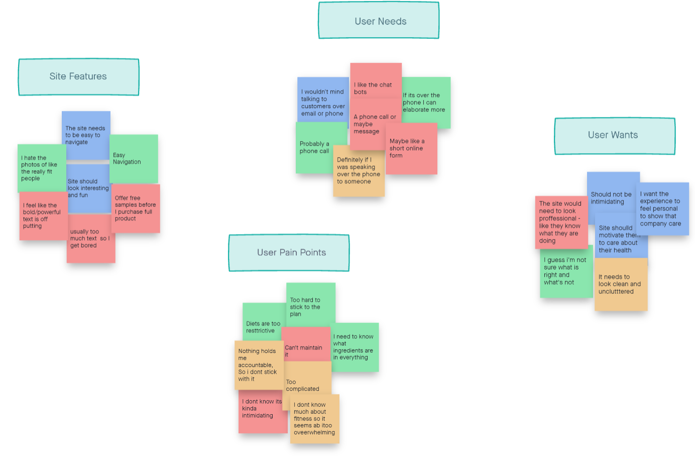
Transforming Insights into Actionable Goals
After gathering qualitative insights through interviews and competitive analysis, I transitioned into defining the core user needs and business objectives. This step helped ensure that our design decisions remained grounded in empathy and data.

Ideate
Structuring the Solution
With well-defined personas and user needs in place, I transitioned into the ideation phase - focusing on the architecture and functionality of the product. The goal was to ensure a seamless, intuitive experience from onboarding to long-term engagement.

User Flow: Guiding Users With Purpose
To map a user’s path from entry to action, I created a streamlined User Flow that prioritised efficiency, personalisation, and engagement. Each step was designed to minimise cognitive load and help users build habits around plant-based eating.
Site Map: Organising the Experience
A clear site architecture was essential to ensure scalability and user confidence when exploring the platform. Below is the structure I proposed to keep navigation intuitive while supporting content depth:

Branding: Building a Cohesive Visual Identity
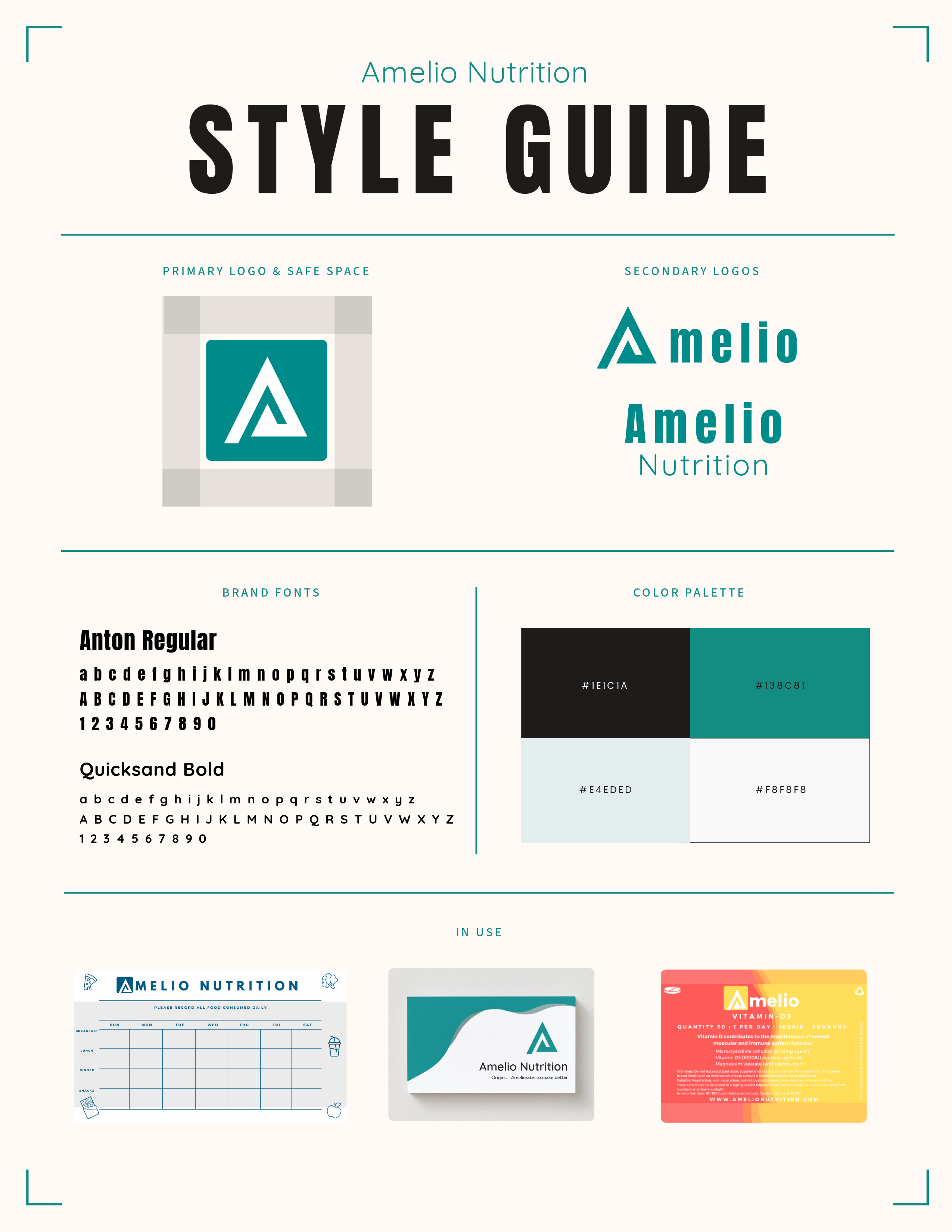
To position Amelio Nutrition as a credible and aspirational brand, I crafted a clean, modern visual identity that evokes trust, clarity, and wellness. The brand was built to appeal to users seeking simplicity in health - while feeling science-backed and approachable.

Logo System
The logo suite includes a primary mark and two secondary lockups, offering flexibility across web, mobile, and physical applications.
Primary Logo: A bold "A" within a secure safe-space grid, representing guidance and structure.
Secondary Logos: Horizontal and stacked variations to maintain visual consistency across touchpoints.
Typography
Typography was chosen to reflect the balance between strength and clarity:
Anton Regular: A bold display font used for headings - establishing confidence and visual hierarchy.
Quicksand Bold: A geometric sans-serif for body copy and UI elements - clean, friendly, and highly legible.
Applied Branding
Brand assets were tested across key touchpoints to ensure consistency and legibility:
Weekly Meal Planner for print and digital.
Product Packaging for vitamins.
Business Cards for stakeholder networking.
Each use case adhered to spacing rules, font hierarchy, and contrast guidelines from the style guide - ensuring brand integrity across all mediums.
Low-Fidelity Wireframes
To bring structure to the ideas generated during ideation, I created hand-drawn wireframes that mapped out the core pages and functionality of the platform. This early visualisation helped test content hierarchy, spot UX friction points, and validate layout decisions before moving to high-fidelity design.
Homepage
Goal:
Clearly communicate the platform’s unique value while guiding users to take action.
Key Update:
The homepage was structured to immediately highlight Amelio’s core value proposition and drive engagement.
A new “Personalised Plans” section was introduced to showcase one of the product’s most important features. This section acts as a visual anchor, guiding users directly to a tailored nutrition solution that fits their goals.
Personalised Plan Page
Goal:
Educate and onboard users into building a plan that works for their goals and lifestyle.
Update:
This page initially lacked clarity around the user journey, which could lead to drop-offs. I redesigned it to include a clear “How It Works” section, walking users through the steps - from filling in tracker to receiving a consultation call - to help them understand the value and reduce friction during sign-up.
Outcome of Wireframing
Creating wireframes at this stage allowed me to:
-
Align feature placement with user priorities
-
Simplify decision-making with clear CTAs
-
Identify content gaps and reorganise information hierarchy
-
Test layout responsiveness for future mobile versions

Test
Validating the Experience
To ensure the final design met user needs and aligned with business goals, I conducted usability testing on a mid-to-high fidelity prototype of the Amelio Nutrition platform. The primary goal was to evaluate how well users could navigate the site, understand core features, and complete key tasks without friction.
Prototype and Final Design
High-Fidelity Prototype
After multiple iterations based on user feedback and business needs, the final design brings together a clean, personalized experience aligned with Amelio’s mission: making nutrition simple, actionable, and sustainable. These high-fidelity screens reflect improved clarity, user flow, and trust-building visuals.


Reflection and Learning
Future Impact & Opportunities
The final product not only addresses current user pain points but also lays the foundation for long-term scalability and impact. As Amelio grows, the platform is well-positioned to evolve into a comprehensive, user-centered ecosystem for health and wellness.