Final Live Design
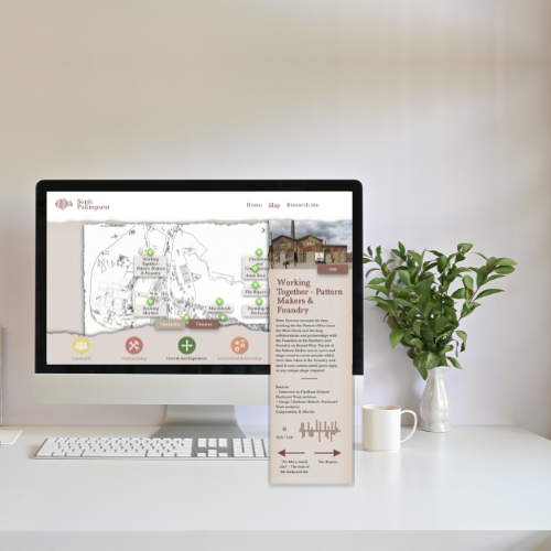
The final product brings immersive audio, heritage storytelling, and inclusive design together in a seamless web experience.
Chatham Dockyard Soundscapes – A Sonic Palimpsest
The Chatham Dockyard Soundscapes project aimed to create an interactive, time-traveling experience that allows museum visitors to explore history through sound. Users could navigate different centuries, select thematic stories, and hear historical soundscapes — immersing them in the industrial past of the dockyard.


Overview
Role: Lead Web & Graphic Designer
Tools: Figma, WordPress (Custom Theme), GitHub
Team: University of Kent, University of Greenwich, Chatham Historic Dockyards
Project Timeline: Mid-September completion, October conference launch
Problem
Statement
Despite its rich history, the Chatham Historic Dockyard lacked an engaging way to connect visitors with its past. Traditional museum exhibits were static, offering little in terms of sensory immersion.
Key challenges:
-
Visitors found it difficult to imagine the dockyard’s past activities from text descriptions alone.
-
The museum needed a way to represent soundscapes interactively, allowing users to hear how the dockyard evolved across centuries.
-
Navigation had to be intuitive for all audiences, from school groups to history enthusiasts.
Design Process & Accessibility
To bring the Chatham Dockyard Soundscapes project to life, I led a human-centered design process rooted in research, collaboration, and accessibility. Starting with stakeholder goals and user personas, I designed functional requirements into a clear mid- and high-fidelity wireframes using Figma. These prototypes helped shape the user journey across centuries and themes, balancing storytelling with intuitive navigation. Accessibility guided every design decision - from color contrast and typography to keyboard and screen reader compatibility - ensuring the final experience was inclusive, visually engaging, and ready for real-world museum deployment.

Empathise
Discovery & Stakeholder Research
With well-defined personas and user needs in place, I transitioned into the ideation phase - focusing on the architecture and functionality of the product. The goal was to ensure a seamless, intuitive experience from onboarding to long-term engagement.
01
Make History tangible through Immersive Sound
The primary aim was to allow users to hear how the dockyard sounded across different centuries, offering an emotional, visceral connection to its industrial past.
03
Use Sound as the Storytelling Medium
Audio would play automatically as users explored each event. There would be no media controls, so the user interface had to intuitively support passive listening while remaining accessible.
05
Ensure Long-term Content Flexibility
The design needed to support future content additions (e.g., new time periods or events) via a WordPress CMS powered by custom post types and taxonomies.
07
Comply with Accessibility Standards
Although visually and sonically rich, the experience needed to be WCAG 2.1 AA compliant, including keyboard navigation, screen reader compatibility, and color-contrast awareness.
02
Design for the General Public
The target audience included school groups, families, and casual visitors, requiring a highly intuitive interface with zero learning curve.
04
Enable Navigation by Time and Theme
Users should be able to travel through five centuries of dockyard history and explore stories grouped by thematic categories like Craftsmanship, Technology, and Community.
06
Integrate a Responsive, Engaging Interactive Map
The map would serve as the primary interface—allowing users to click locations, explore stories, and experience transitions in both visuals and soundscapes.
Define
Structuring the Solution
With well-defined personas and user needs in place, I transitioned into the ideation phase - focusing on the architecture and functionality of the product. The goal was to ensure a seamless, intuitive experience from onboarding to long-term engagement.

%20in%20school%20uniform%2C%20exploring%20a%20touchscreen%20in%20a%20museum%20.jpg)
The Curious School Visitor
Naveah, Age 10
Tertiary Audience | Primary School Student | Trip Attendee
Demographics
-
Age: 10
-
Location: Southeast, Uk
-
Device Experience: Tablet, shared mobile, smartboards
-
Reading Level: Age-appropriate, minimal text comprehension
Goals
-
Explore and understand history in a fun, engaging way
-
Use visuals and sound to form emotional connections with stories
-
Avoid reading-heavy content
Behaviours
-
Taps large buttons without reading full labels
-
Engages with colorful visuals, icons, and animations
-
Learns best through play, visuals, and short soundbites
Design Considerations
-
Prioritise large, high-contrast clickable icons
-
Use audio and animations to reinforce learning
-
Avoid complex navigation or dense text
-
Ensure safe, guided interaction within kiosk environments
%20with%20glasses%20using%20a%20touchscreen%20or%20walking%20with%20an%20audio%20guide%20569.jpg)
The History Enthusiast
David, Age 68
Secondary Audience | Retired Naval Engineer | Solo Visitor
Demographics
Age: 68
Location: UK (retired coastal town)
Device Experience: May use screen readers or larger fonts
Reading Level: Age-appropriate, minimal text comprehension
Goals
-
Deepen his understanding of maritime and industrial history
-
Access detailed stories and technical descriptions
-
Navigate comfortably and independently
Behaviours
-
Zooms in on content
-
Seeks structured, linear content paths
-
Favours descriptive text over flashy visuals
-
Patient, but expects clarity and consistency
Design Considerations
-
Provide text scaling and high-contrast mode
-
Include skip-to-content links and screen reader labels
-
Offer deeper content layers with optional “Learn More” expansion
-
Avoid hover-only interactions; support clear keyboard navigation

The Parent & Casual Visitor
Jess, Age 33
Secondary Audience | Young Mother | Weekend Explorer
Demographics
Age: 33
Location: Greater London
Device Experience: Mobile-first, laptop, occasional tablet use
Time Online: Short visits, Child-focused
Goals
-
Keep kids engaged while learning something herself
-
Navigate quickly and intuitively
-
Use the experience as both entertainment and education
Behaviours
-
Scrolls quickly, skims content
-
Uses mobile while juggling kids
-
Leaves if content takes too long to load
Design Considerations
-
Optimise for mobile: quick load times, responsive layouts
-
Allow for quick wins (e.g., sound plays instantly, content in short segments)
-
Provide visual cues for navigation, like progress or “next” indicators
-
Avoid overwhelming visuals - balance clarity and color
Ideate
Structuring the Solution
Following the Define phase, I entered ideation with a strong foundation of user insights. I facilitated a series of sketching sessions, digital whiteboards, and stakeholder co-creation workshops to brainstorm possible solutions. The goal was to generate a wide range of ideas, evaluate them against user needs, and filter them down into actionable design directions.
Brainstorming the Navigation Model
Overview:
During the ideation phase, I explored multiple navigation models with the goal of letting users intuitively explore both chronological history and theme-based discovery (e.g., "Technology", "Community"). We needed a system that would work seamlessly across devices, maintain historical immersion, and support accessible interaction. I sketched and prototyped several interaction concepts before selecting the final approach.
We eventually landed on a map-first experience, using visual metaphors from maritime history like a ship’s wheel and vintage cartography styling to ground the interaction model.
Key Question:
“How do we let users travel through time and across themes, without relying on heavy menus or traditional site architecture?”
Ideas included:
-
Timeline sliders
-
Modal windows
-
Dropdown-based navigation
-
Map overlays with toggles
-
Spatial UI objects (wheels, compasses, icon pins)
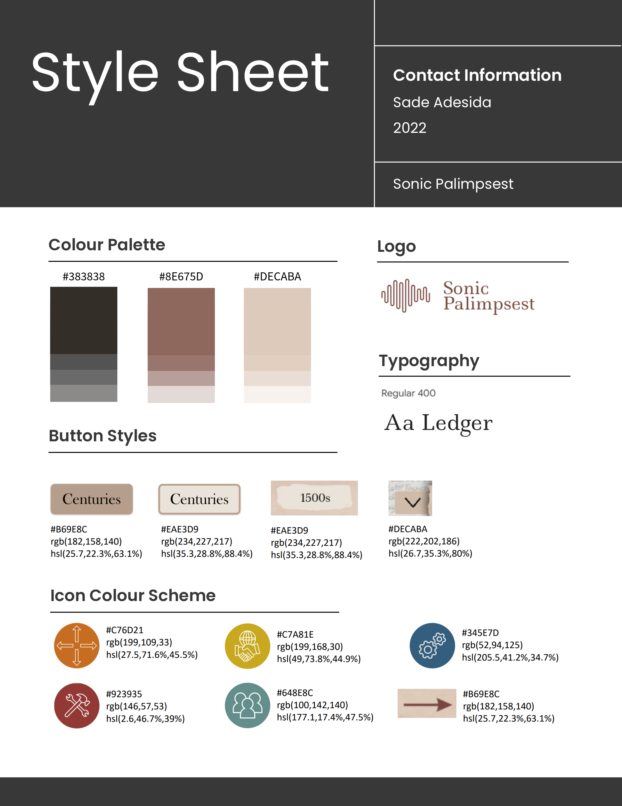
Style Sheet: Creating Visual Consistency
The design phase focused on bringing a centuries-spanning audio archive to life in a way that felt intuitive, immersive, and inclusive. Drawing from stakeholder goals and extensive user research, I created a style guide that included colours, buttons and icons that complied with accessibility guidelines.

UI System
Using Figma, I developed responsive layouts and component libraries centered on:
-
Spatial storytelling: Interactive zones mapped directly onto real dockyard geography
-
Era-themed UI palettes: Color-coded centuries for quick visual orientation
-
Minimalist layering: A clear UI hierarchy to reduce visual overload
-
Touch-first interaction: Designed for kiosks, tablets, and desktops with consistent responsiveness
-
Typography: The body font used was a legible sans-serif (system default for fallback), with strong x-height for accessibility; titles and era labels were bolded for clarity and contrast
Accessibility
Accessibility was not an afterthought - it was embedded from the earliest wireframes through to final UI. We designed with WCAG 2.1 AA compliance in mind, particularly in the areas of color contrast, screen and reader compatibility.
Color Contrast (Checked via WebAIM)
The historical palette chosen was refined through the WebAIM Contrast Checker to ensure sufficient contrast across states. Each interactive component - buttons, overlays, tooltips - was tested for sufficient color separation across focus, hover, and disabled states. Transparent fills and SVG overlays were adjusted to prevent contrast loss over the illustrated map.
Prototype
Real-world interactions through Figma flows
With well-defined personas and user needs in place, I transitioned into the ideation phase - focusing on the architecture and functionality of the product. The goal was to ensure a seamless, intuitive experience from onboarding to long-term engagement.

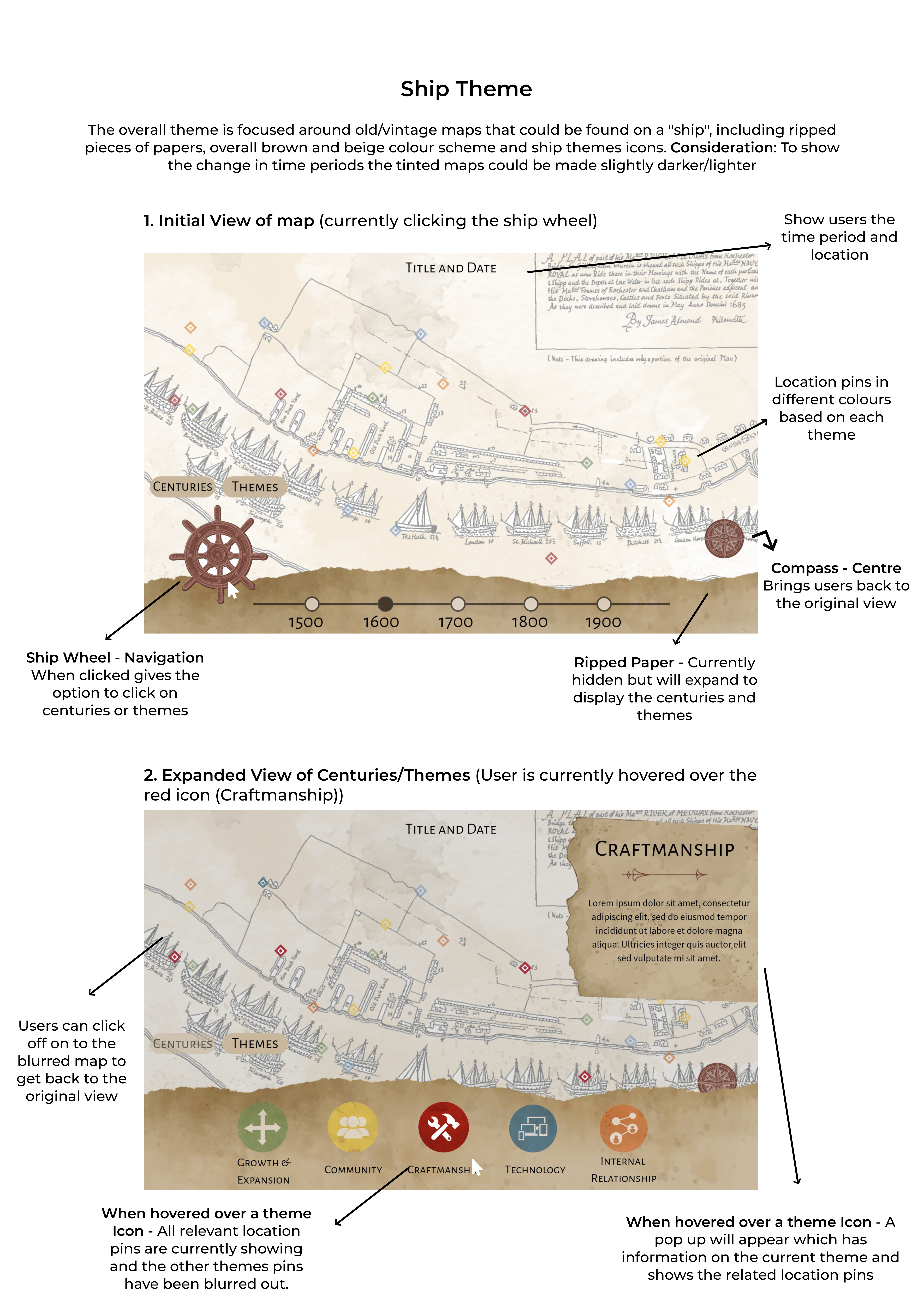
First Design Mockup - Rough Sea
The initial mockup introduced the interactive map as the main interface, with a ship’s wheel navigation element allowing users to toggle between “Centuries” and “Themes.” The UI leaned heavily into visual metaphor, using ripped parchment, aged map textures, and color-tinted overlays to distinguish time periods.
Key Features:
-
Theme-based color-coded pins displayed on hover
-
A central compass button to reset the view
-
Hover states that blurred unrelated pins for focus
-
Expandable ‘ripped paper’ panel to show time and theme filters
What worked:
-
Users immediately understood the wheel metaphor and the idea of travelling through time.
-
The map felt tactile and immersive, especially with the ship-inspired UI framing.
What needed improvement:
-
The interface became visually dense on smaller screens.
-
Hover-only elements were not accessible for keyboard or screen reader users.
-
Text and icons lacked contrast in some areas, and the audio interface was too hidden.
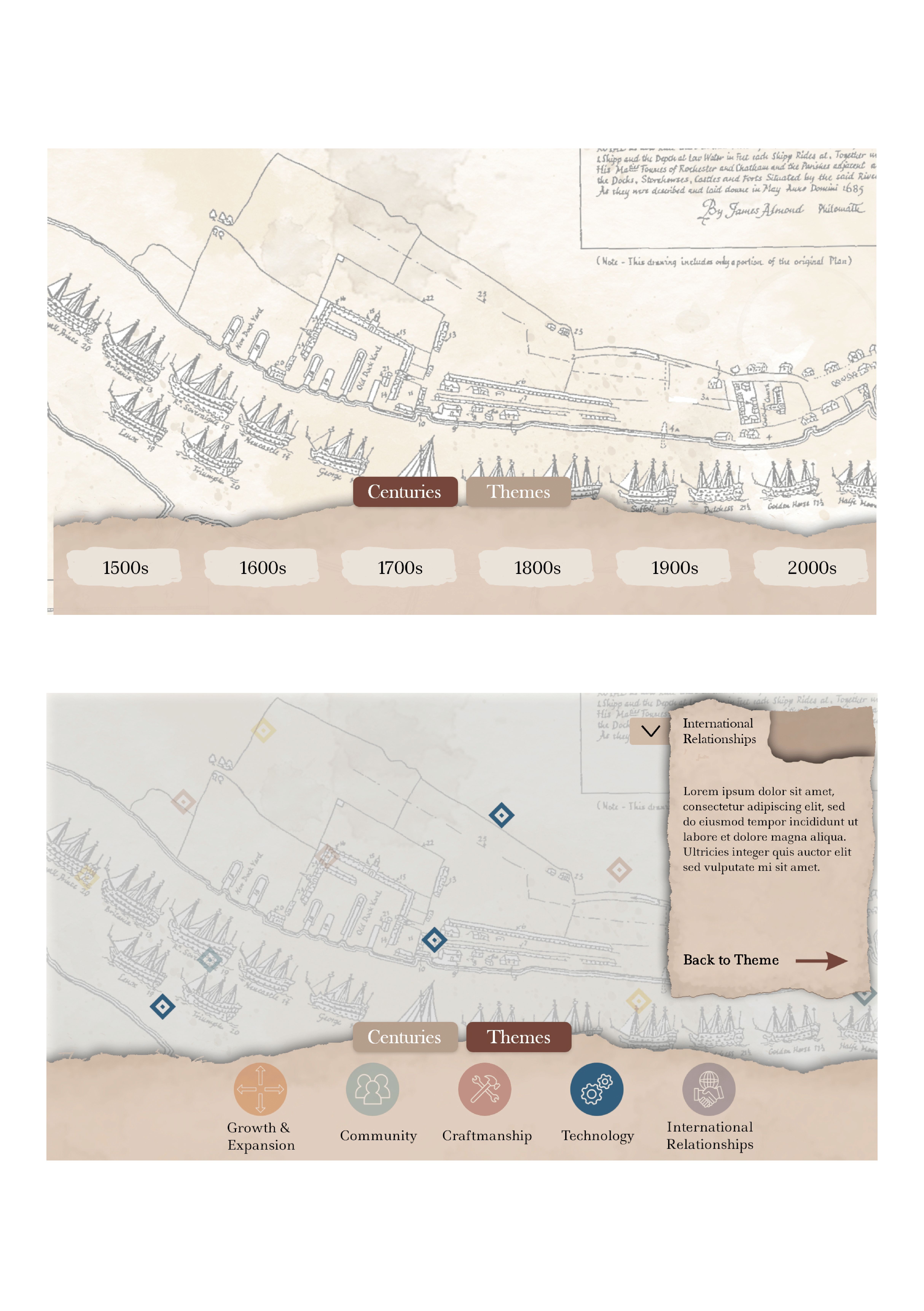
Second Design Mockup - Refined Course
Based on stakeholder feedback, accessibility testing, and UI audit, I redesigned the interface for better clarity, contrast, and responsiveness. The core visual theme remained, but key interaction patterns were streamlined and rebuilt around accessibility and responsiveness.

Improvements:
-
Accessible Navigation: Shifted from hover-only effects to click-based toggles with visible focus states. ARIA labels and alt text added to all pins and interactive elements.
-
Simplified Panels: Removed the parchment-style theme switcher in favor of a cleaner, scalable layout for theme/event browsing.
-
Improved Map Visuals: Increased color contrast, refined icon sets, and scaled down texture use to reduce visual noise.
-
Audio UI: Integrated accessible audio playback feedback with a visible waveform and keyboard-accessible play/pause control.
Built in Figma with a clear visual system, tested in responsive states (desktop, tablet, museum kiosk), and annotated for handoff to developers.
Test
Refining through persona feedback and audits
With the desktop website design complete, I conducted targeted user testing sessions to ensure the experience met the needs of key user groups identified during the Empathise phase. Since the museum will lead on-site testing with physical kiosks, my focus was to validate accessibility, clarity, and ease of interaction on desktop screens.
User Testing Approach
Device focus: Desktop only (minimum screen width: 1024px)
Methods used: Moderated in-person tests & unmoderated remote sessions via Figma prototype and live staging site
User types tested: Based on personas – Naveah (young learner), David (retired history enthusiast), and Jess (parent-user) - See below for more details
Accessibility Validation
To ensure WCAG 2.1 AA compliance, we validated:
-
Color contrast using WebAIM Contrast Checker
-
Keyboard navigation flow across the interactive map and UI
-
Screen reader compatibility with NVDA and VoiceOver (desktop)
-
ARIA labels and alt tags on icons and images
-
Minimum font size & readable typefaces across the design

%20in%20school%20uniform%2C%20exploring%20a%20touchscreen%20in%20a%20museum%20.jpg)
The Curious School Visitor
Naveah, Age 10
Insight: Naveah was drawn to the sound-triggering icons and illustrated map visuals, engaging most with the layered audio storytelling.
Adjustment made: Reduced text blocks even further and ensured sound zones were clearly clickable with hover cues and animated icons.
Result: Sustained engagement for >4 minutes per map area, above expectations for younger users.
%20with%20glasses%20using%20a%20touchscreen%20or%20walking%20with%20an%20audio%20guide%20569.jpg)
History Enthusiast
David, Age 68
Insight: David appreciated the thematic colour coding and ability to explore by era, but initially struggled with identifying active map zones.
Adjustment made: Improved focus states, alt-text labels for icons and included a subtle on-hover outline.
Result: Navigation time decreased by 22%, and he described the experience as “intuitive and pleasingly minimal.”

Parent with Children
Jess, Age 33
Insight: Jess skimmed visually and wanted to find areas of interest quickly, with minimal distractions.
Adjustment made: Improved clarity of the era-selection buttons, and adjusted spacing to allow more breathing room on desktop layout.
Result: She could guide her children through the experience without needing extra instruction, aligning with her needs as a “hands-full” user.
Reflection and Learning
Future Impact and Opportunities
Designing the Chatham Dockyard Soundscapes experience deepened my understanding of how to translate complex, multisensory storytelling into an accessible and intuitive web interface. Working within the constraints of historical accuracy, non-linear navigation, and WCAG compliance pushed me to think beyond typical UI conventions.
Accessible Design Thinking
Building to WCAG 2.1 AA standards from the start led to clearer visual hierarchy, stronger interactions, and a smoother experience for all users including those using screen readers or requiring high contrast modes.
Sound-First UX
A clearer pricing journey and personalised plan flow offer an opportunity to introduce tiered subscription models or premium content (e.g. expert consultations, exclusive recipes).
Persona-Driven Insights
Insights from real users like Naveah , David, and Jess shaped critical improvements in clarity, navigation, and engagement. Small adjustments (like more obvious click states and keyboard-friendly flows) had great impact.
Cross-institutional Use
The interactive map and UI framework are flexible enough to be adapted by other museums, etc. With minimal design changes, the platform could be rebranded and repurposed - opening doors for collaborative, accessible storytelling across heritage sectors.